Good curb design is important
There are some practical and some aesthetic factors in good design.

Practical design rules
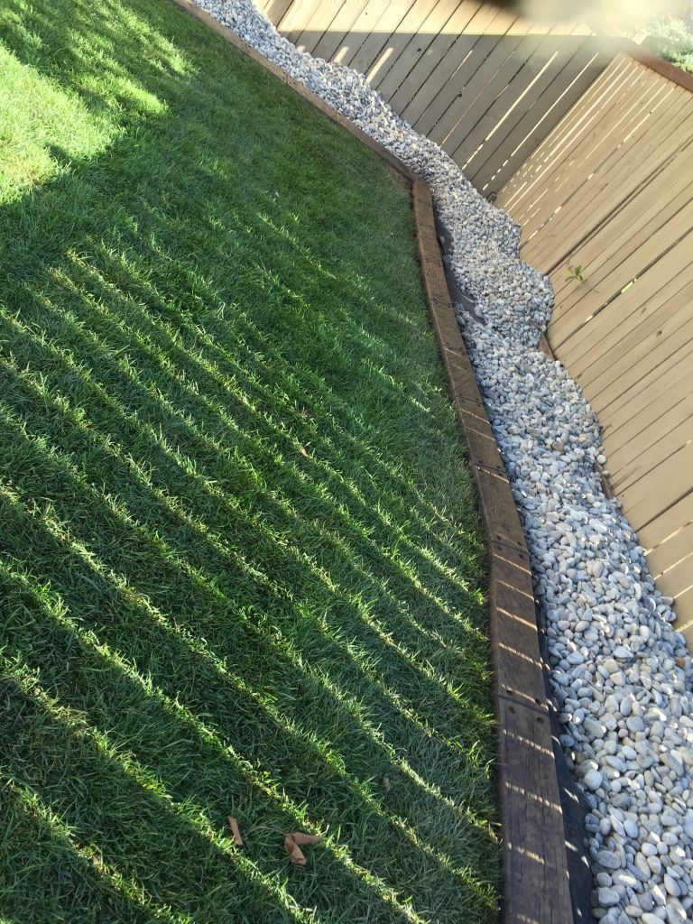
- Curb should be done mainly using curves. Why? because the earth is round, not flat! When you look at a straight line that runs over a slight hill, it looks straight only when you are standing directly above it. If you are standing off to the side in any way, the line will appear to be curved! The thing about a landscape is that you are rarely ever standing directly in line with a strip of edging. You are virtually always seeing that line from a different perspective. Therefore, the line will appear curved when it is actually straight. Theoretically, a straight line would look good from every angle if the ground is perfectly flat. The problem is, that land (the earth) is NEVER perfectly flat, nor should it be! In fact, it must be contoured for good drainage. Some people have homes built with “modern” blocky look, and they think the landscape would look good to go with that theme- wait a minute! The house is built using straight edged materials, while the earth still has those subtle curves in it. Trying to stick straight lines onto a curvy surface is the WRONG way to go! Some may see this as a rule about aesthetics, but believe me, after doing many decently straight lines that looked bad from a different angle, I say this is the number one curbing rule either way.
- Landscapes must be looked at from the ground, not from the sky above the house. While this may sound obvious, it isn’t always obvious to landscape designers. We have seen many “professionally” drawn-to-scale landscape plans that look great when you are looking down on the plan drawn on a flat piece of paper. The trouble is, that we don’t often sit in a helicopter a hundred feet above the roof of the house! That same plan can look terrible when implemented on the (not always flat) land and seen with your eyes not at 90 degree angle above the land, but a 3-4 degree angle perspective because you are only 5-6 feet tall but the land is a hundred or more feet long and wide!
- Avoid tight inside curves. You need to keep your lawn mowing in mind. if the curve is too tight to run your mower along it easily, then you should not run curbing that tight on an inside radius. Outside curves can be tight, because you can pivot a mower easily around a small object.
- Avoid running into walls or fences head-on. Never run into them with an acute angle. Again this is for mowing purposes, because of the geometry of how a lawnmower cuts grass. If you can avoid it, you want to get the wheel of your mower on and off the curb easily without you walking over your plants inside the bed, or leaving a chunk of unmowed lawn. That way your design reduces the amount of areas you need to go back with a lawn trimmer or “weed whacker”
- Close off any “No grass zones” using the curb. Face it. There are some areas you just can’t grow a good lawn. Mainly under the eaves of a house (too dry) , against a south or west wall (too hot because of reflected sunshine), and between homes on a slope (too dry). Frequently, we are asked to curve the front flower bed in to end it against the front corner of the house. While this often makes sense, there are many times when it would be better to go across to the property line and end there, because no lawn is going to grow beside the house anyway.
- Edging the entire perimeter of a back yard. This is a great idea, because it simplifies maintenance. Mowing against a fence, especially wire mesh, is never very tidy looking. putting beds all the way around a back yard is sort of an ideal way of avoiding fence damage and it simplifies mowing. Also the lawn is more likely to look good this way.
- Room for your mower. Keep in mind the width of your lawnmower.
- Vehicle crossings. Don’t expect your curb to stand up well if you drive over it often. Its the ground that really can’t take it, because the curb gets pushed in especially when its soggy. Mowers are usually ok, even the biggest riding mowers because their tires are designed with soggy ground in mind.
Aesthetic design guidelines
- Avoid straight lines on the property line. Especially in the front yard. It just looks like you aren’t able to get along with the neighbour. Our front yards are not so much our “personal space” as they are about the beauty of the land we live in. When we landscape in a front yard, we should not be constrained by the straight lines “yours and MINE!” that the law forces onto us. Otherwise, we should all be building ten foot walls right up to our property edges all the way around as in some countries. Therefore, a gently curved line just inside your property line looks much better, because it will avoid the ugliness associated with point 1 under the practical design rules.
- Avoid symmetry. Your face is beautiful, but it is not symmetrical. The earth is gloriously beautiful, but almost nothing is symmetrical in nature. Symmetry is a human construct being forced onto nature. If you have a hang-up about symmetry, apply it indoors, not outdoors where real symmetry does not exist anyway. In landscaping, it is better to think in terms of oriental feng shui than in terms of symmetry.
- Flowing lines, not equal waves. equal waves along a property line in particular, can look “snakey” if the curves are too much alike.
- Continents fitting together. When fitting islands of trees or shrubs with other border type beds, think about the continents, Lines should reflect each other, so they fit like continents that were once joined but have now drifted apart.
- Rivers of grass. Not an hourglass or a straight highway. When you have two curves coming together and you are supposed to walk between them you can feel “pinched” in the middle, and unwelcome from transitioning from here to there. Its better to have the waves laid out like a meandering river. This is a more comfortable way to move between spaces in your yard.
- Rooms. Modern landscape design has been emphasizing the breaking up of a landscape into rooms- that is , distinct spaces for various activities or themes. You can have the fire pit corner, the game area, and the pond for instance. Good design separates, defines and enhances each of these areas so they feel somewhat distinct. Sometimes we have creates rooms in a back yard by jutting a bed area deep into the centre of a yard and putting higher tree/ shrub combinations in there to create separate spaces.
